

SCOPE OF WORK
Website Design
UI/UX
UI/UX Lead
Vishal Arora
Creative Direction
Adam Carey
LuckyVitamin is a health & wellness e-commerce platform offering quality products alongside guidance from in-house wellness experts. As the website evolved over the years, key customer touch points including the homepage, product pages, navigation, and cart, became cluttered and difficult to navigate, creating friction in the shopping experience. Our team focused on redesigning LuckyVitamin’s core website experience to improve clarity, usability, accessibility, and conversion.
Improving the Path to Purchase: LuckyVitamin UI/UX
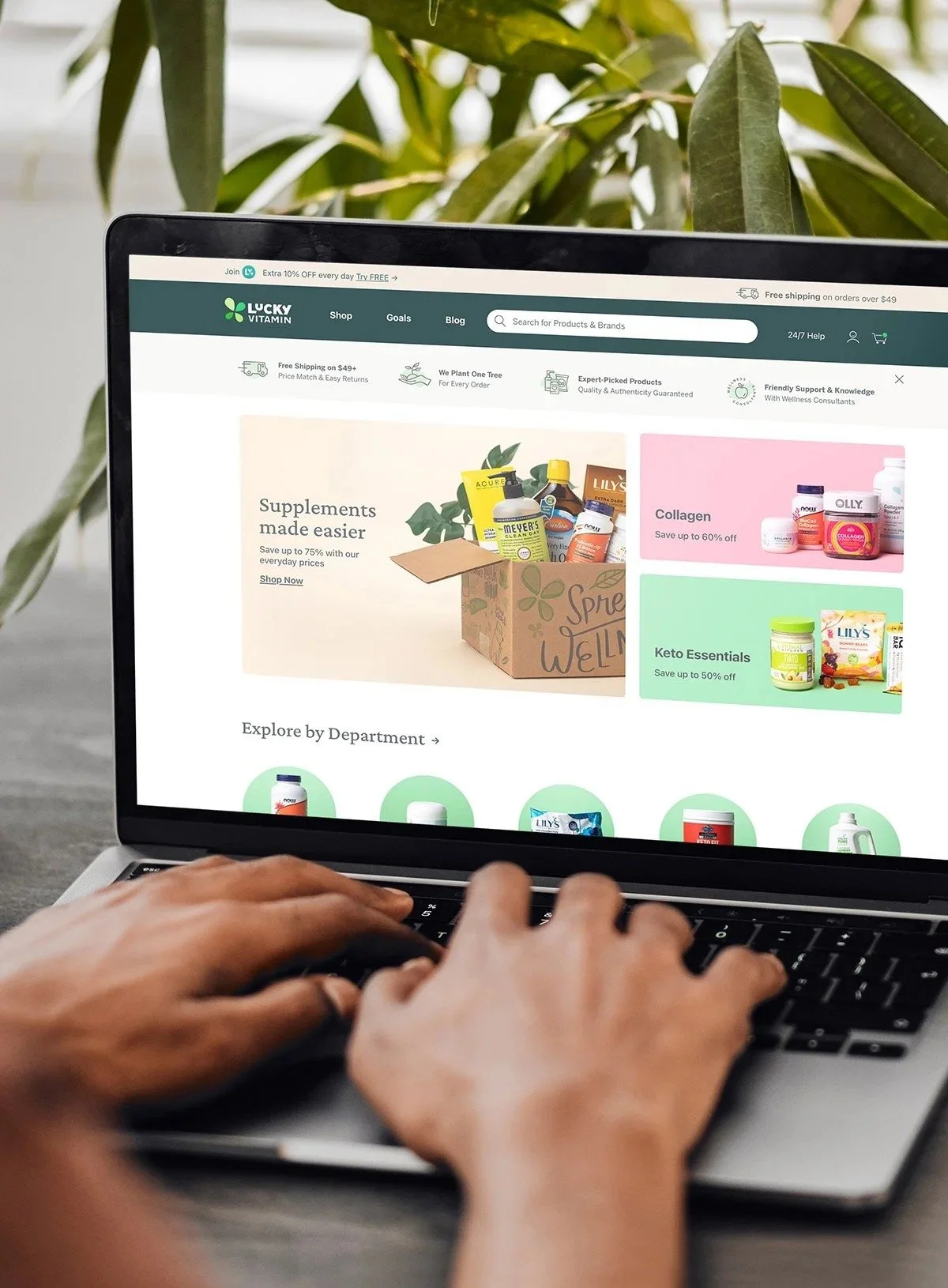
Goal: Redesign the Homepage Experience
The old homepage was crowded and a bit disorganized, causing users to become frustrated or deter new users from giving the site a chance. Our team was tasked with the project of redesigning key aspects of the homepage experience.
Process
Our team took an “all hands on deck” approach to tackling this website redesign project. We meet bi-weekly as a creative team to review component by component, throwing different approaches and designs on the board. Being a regular part of those design meetings, I offered design options and feedback throughout the entire process.
Outcome
Upon user research and testing, we found that these new homepage updates resulted in a 10% lift in conversion rates, by improving search capabilities, removing repetitive deals and promotional banners, and displaying LuckyVitamin's value proposition in a prominent space on the homepage.
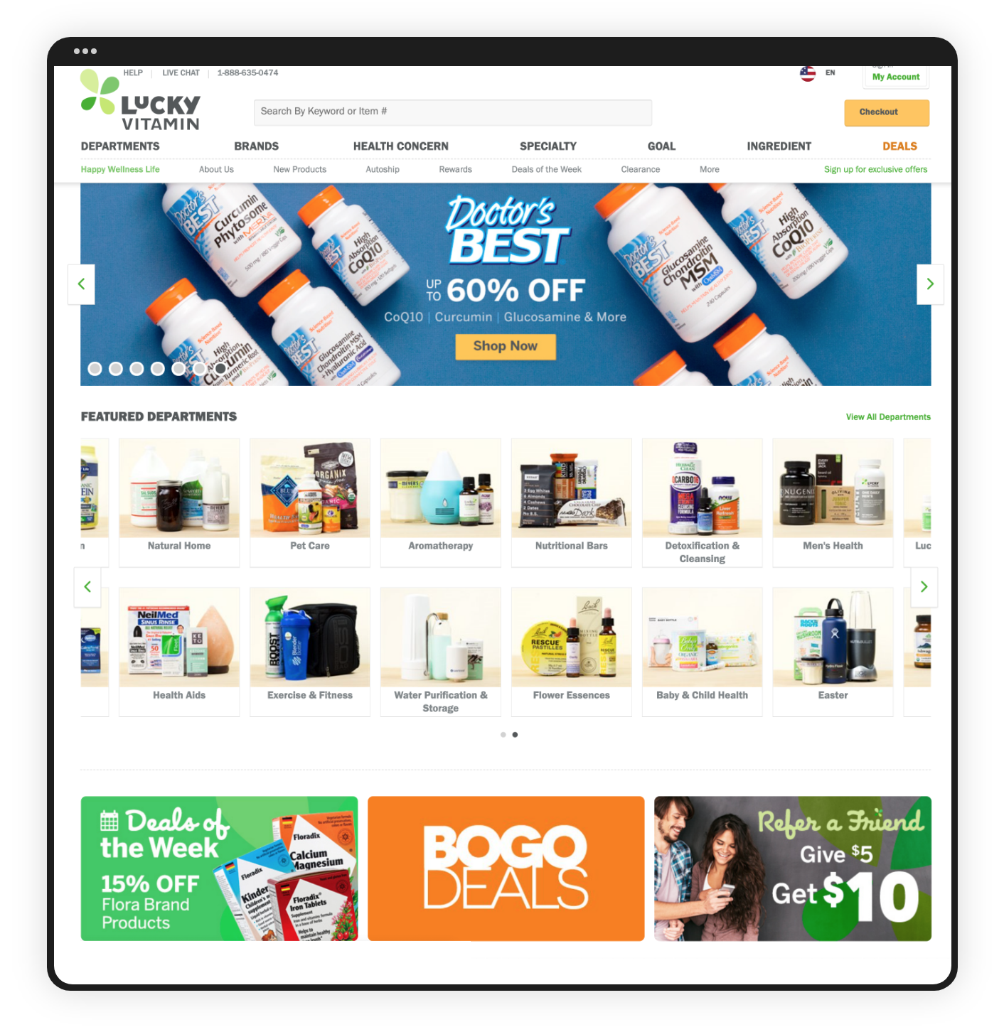
Homepage: Before
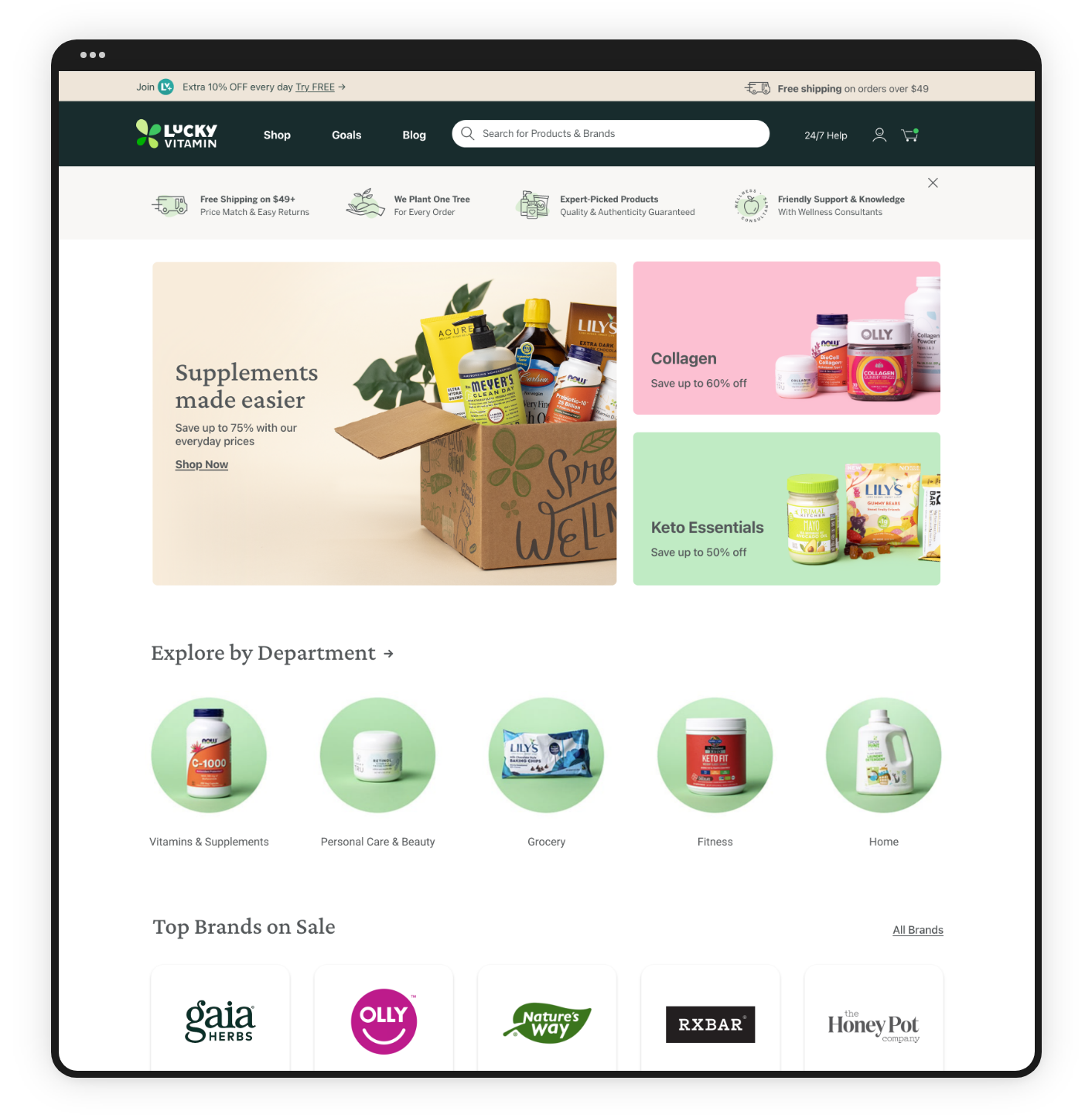
Homepage: After
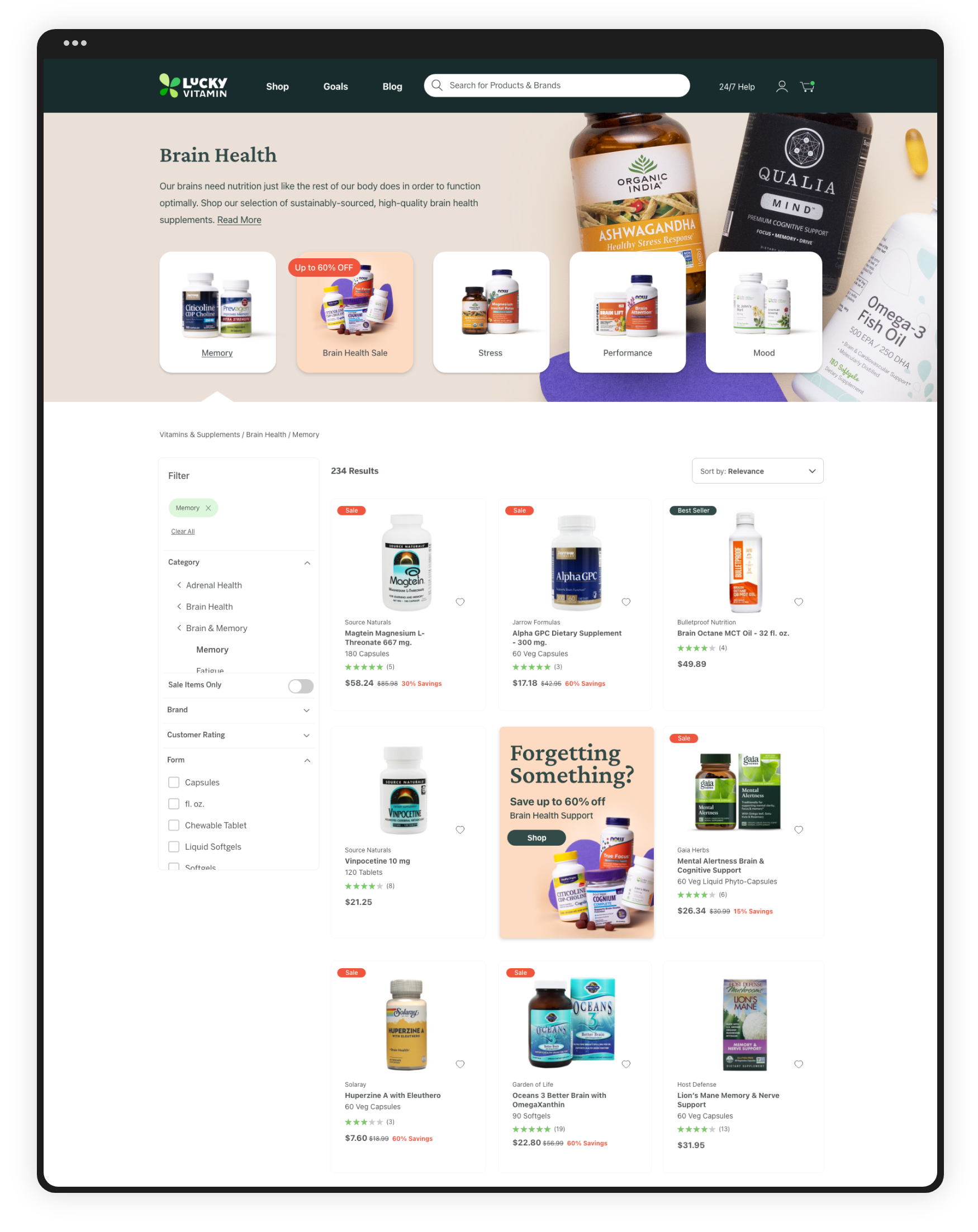
Product Listing Page: After
Product Listing Page Redesign
Project Overview
The product listing pages were long, very densely populated results pages that were definitely overwhelming for our customers. The filters were not always applicable or relevant to the category, and we saw a great opportunity for increasing conversion and overall usage on these types of pages.
Process
Our creative team started with a component-by-component approach to redesigning the listing pages, starting with the filtering system, then each individual product "box," followed by a special filterable category page header. Everyone on the team was part of creating different elements that ultimately came together to create this new and improved listing experience.
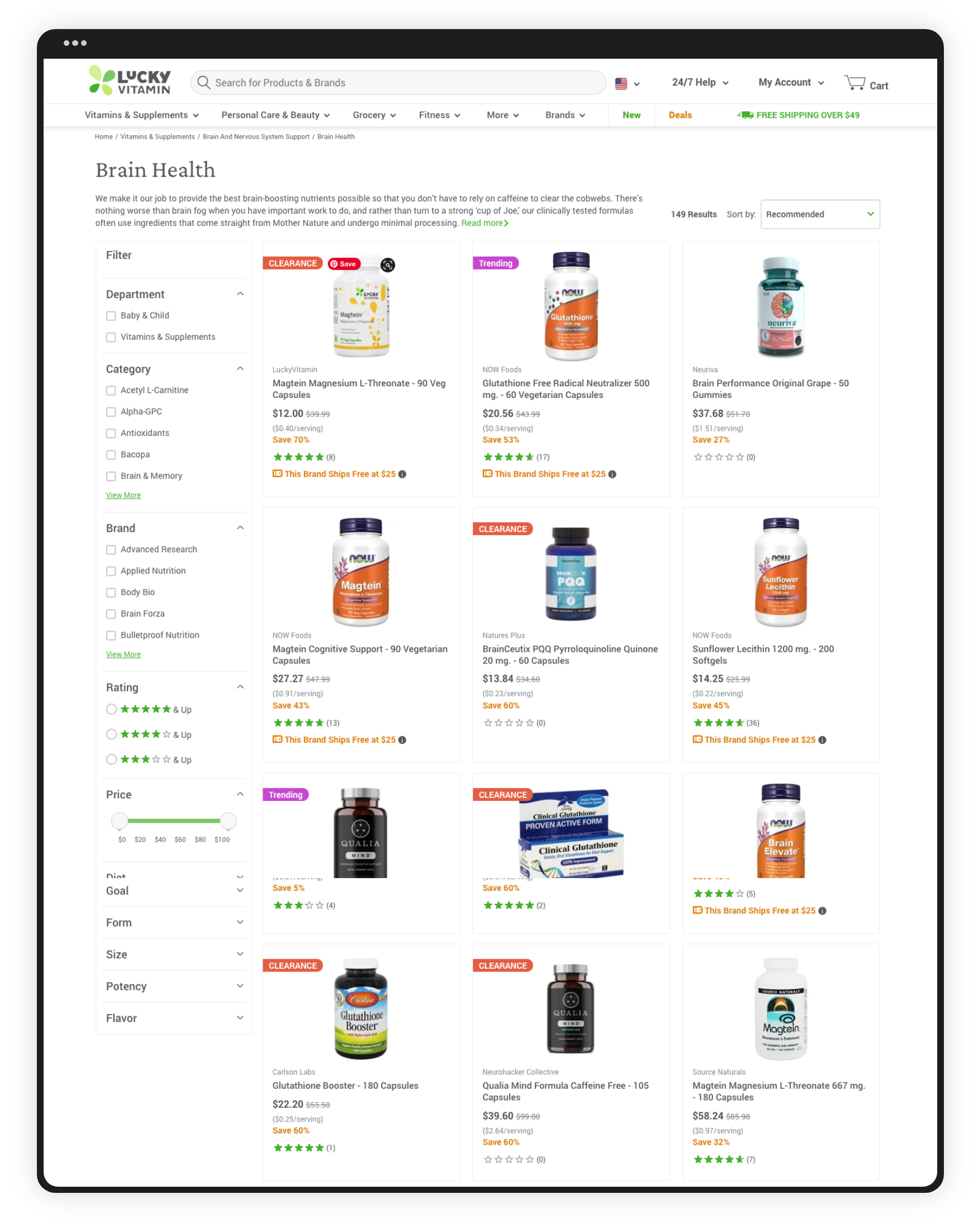
Product Listing Page: Before
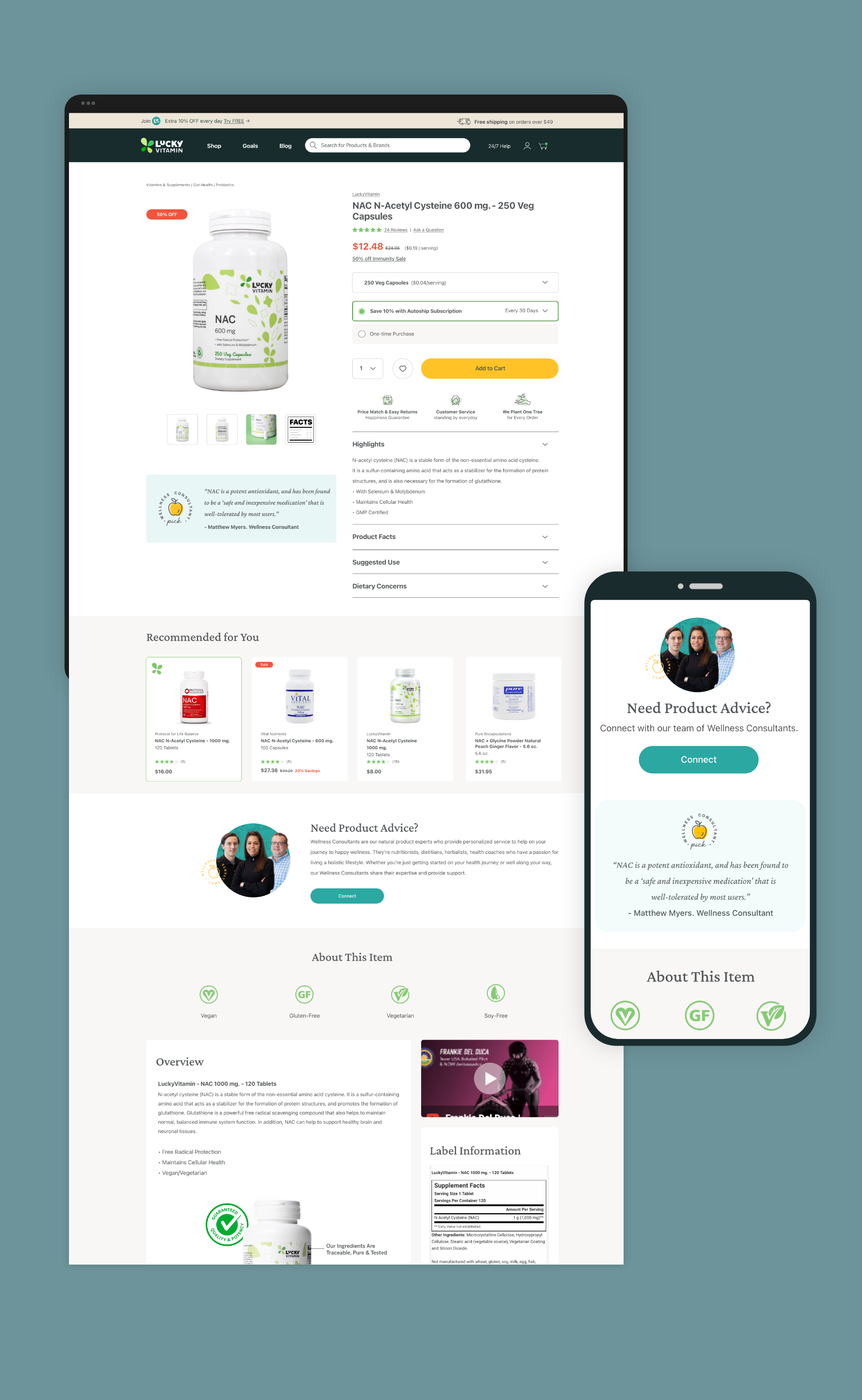
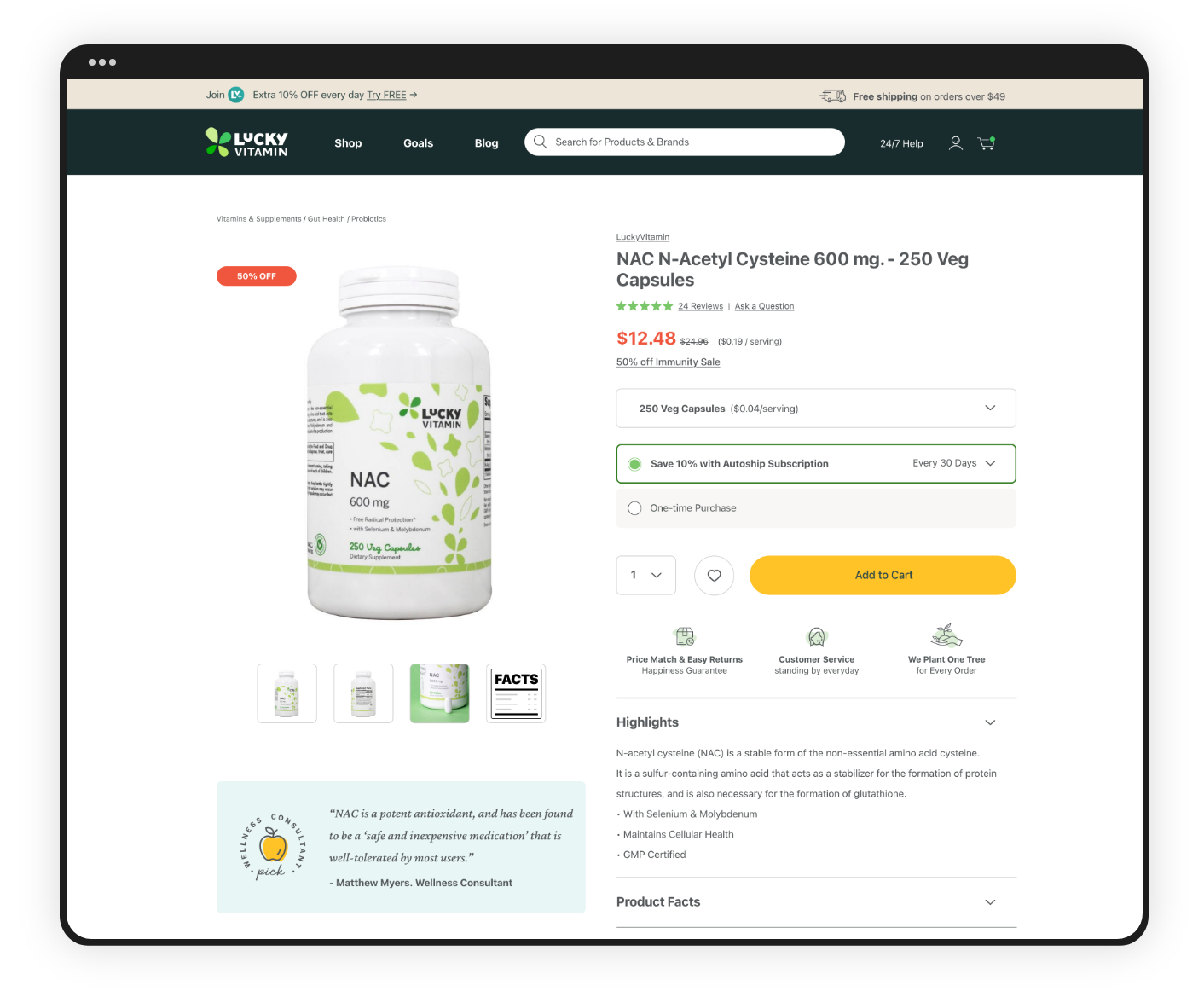
Product Description Page Redesign
Project Overview
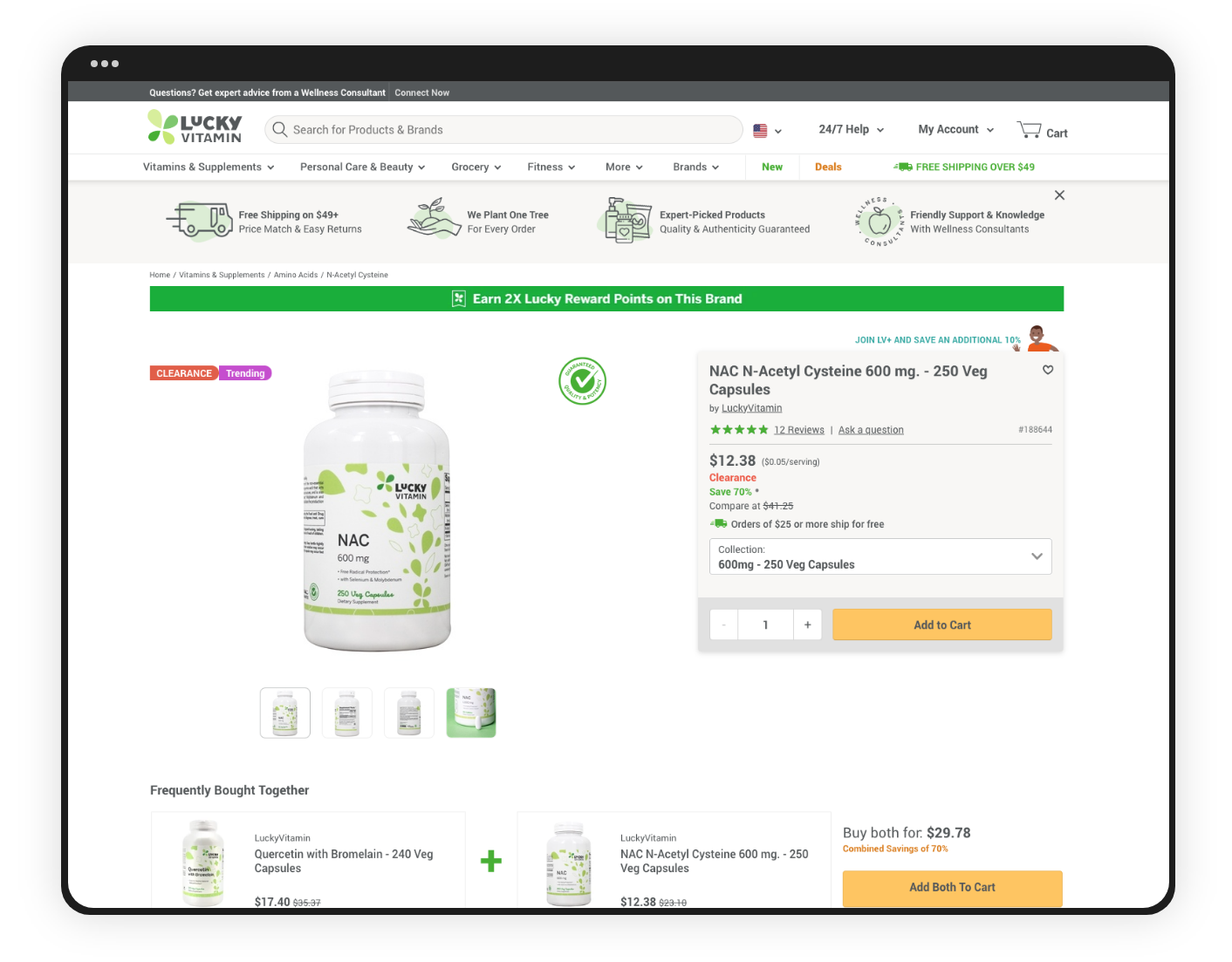
The product description page was arguably one of the most important pages on LuckyVitamin's site. Most customers came to our site through ads, emails or social media, linking them directly to a product page rather than the homepage, so tackling this page was crucial.
Process
By breaking down this page into components, we focused on one at a time, making sure that every element within a larger block met our updated brand and web guidelines, as well as current web accessibility standards.
We all created versions of our "dream pared down buy box," and brought them to our bi-weekly UI meetings, where everyone on the team collaborated and took elements from all ideas to create an updated and more digestible product page.
Outcome
Each component of the product page was tested as we worked through the design process, and won out over the old versions, significantly improving users' experience and conversion rates across the board.
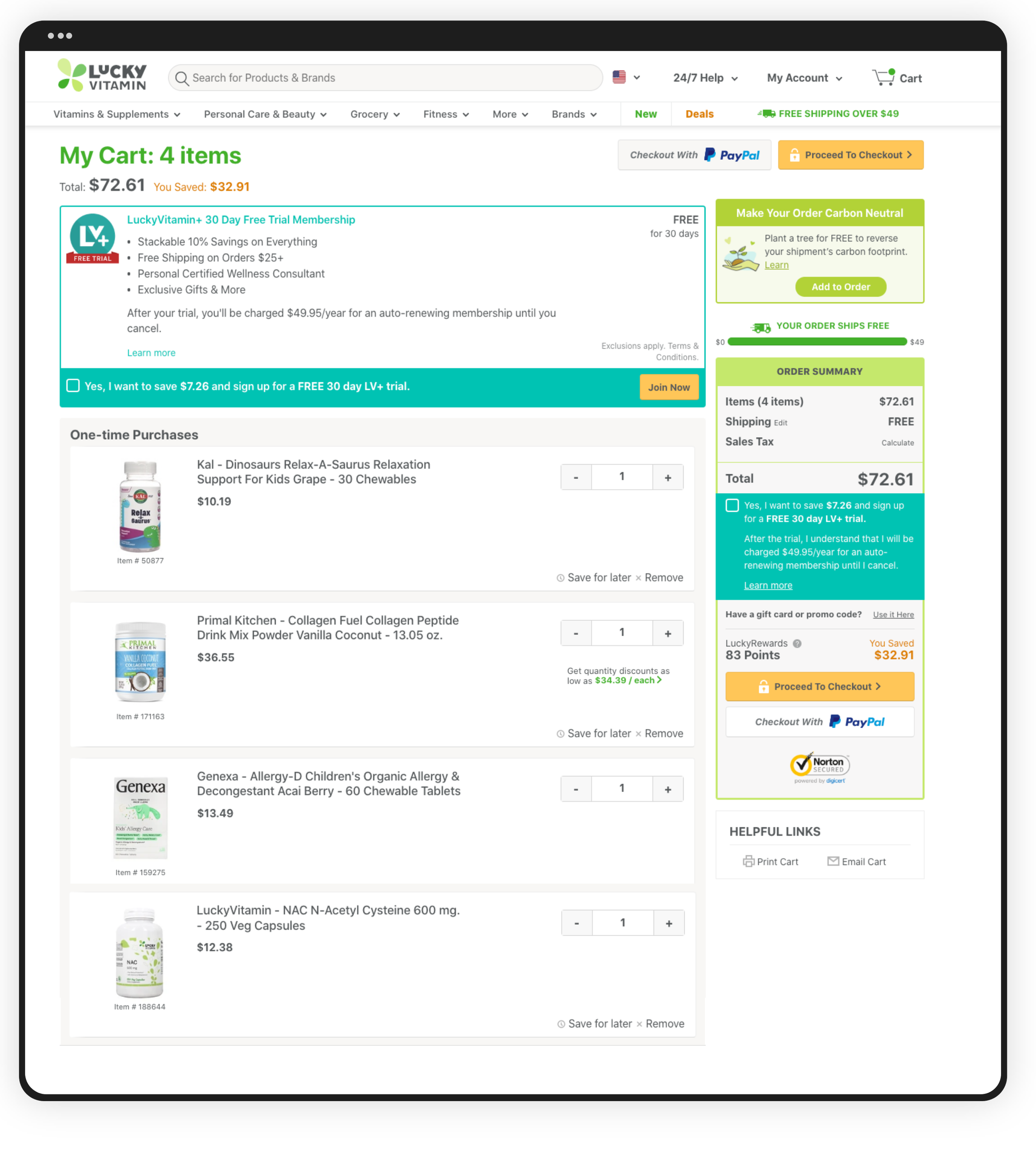
Cart: Before
Goal: Redesign the In-Cart Experience
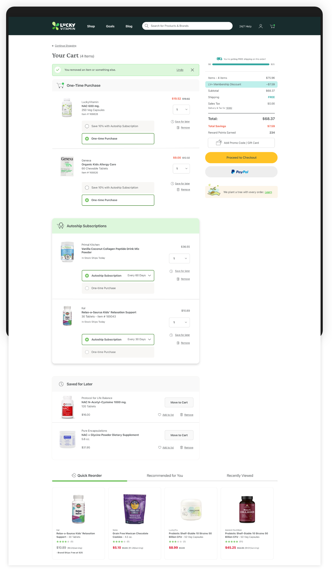
The old in-cart design was cluttered, chunky and altogether confusing for the customer. This lack of clarity and clunky experience was leading some people to abandon carts, or become frustrated once they arrived on this screen.
Process
The creative team was very collaborative on this project. We each came to our bi-weekly meetings with examples of UI carts we resonated with, and also shared our own pain points when it comes to our own shopping experiences to help inform our design decisions.
Outcome
The redesigned cart experience resulted in a 10% conversion lift and allowed customers to check out more quickly and efficiently.
Cart: After
Goal: Redesign Main Dropdown Navigation & Search Bar
Project Overview
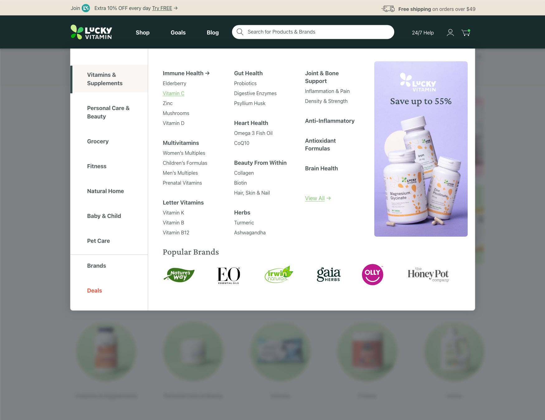
We started with our old navigation and looked at what made it confusing and repetitive, giving us some initial guidelines for what should and shouldn't be included in the redesign. We had many "co-working" sessions where we would design different options together as a team, and compile our different versions into comps that were tested by real user groups.
Outcome
Using AI-driven search features, and reorganizing this main dropdown, we saw a 14% increase in revenue, 8% lift in conversion, and 50% lift in overall search bar usage.
Product Description Page: Before
Product Description Page: After